My music video incorporates the stereotypical media convention of performance in music videos. I studied a wide range of music videos from both underground and popular artists, from a wide range of genres and styles of music, and noted performance as one of the key elements in all of the music videos. I used a continued extreme close up shot of a mouth lip syncing to the lyrics of the song to provide this vital aspect of performance.

The use of the extreme close up also follows Dyer’s theory of stardom that is ever present in music videos. The star is present in my music video, as the viewer can see him singing, however, the ambiguity provided by only seeing a small section of the mouth follows Dyer’s theory that despite being ever present, the star is absent at the same time. Another main convention of music videos that I noted was a narrative that is shown alongside the performance. I also noted that this aspect of narrative generally accompanied the theme of the song, whether it go hand in hand with the beat, or use the lyrics to help tell the story, as stated in Goodwin’s theory of music videos. I decided to use some of the lyrics to accompany the narrative at key points, for example, when the lyrics sing “everyone feels a need for change”, the character enters a room, and then exits in a different change of clothing, therefore linking with the lyrics.
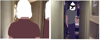
When studying music videos I noted that, specific to my tracks genre, music videos had an element of abnormality and surrealism, and this was a convention I wanted to incorporate into my product. To create this sense of abnormality, I decided to animate my main character using a method called Rotoscoping. This turned my character into a seemingly cartoon character, whilst the rest of the mise-en-scene, setting and characters were left as normal, creating an abstract contrasting element. I also used a combination of long, mid, and close up shots and edited them using straight cuts to have the cuts mirror the rhythm and beat of the song. This is a convention typical of music videos, as it is a manifestation of both the music and the story line, as the two elements fuse into one to create the music video. The best example is the shot of the two characters in the car, as the cuts go completely with the beat, to create the sense of a journey, without having to use a long take that doesn’t appeal to the audience. I also used sections of black screen between some cuts to mirror the drum beat of the song. I also added some intertextual reference, something Goodwin states as an often found factor of music videos in his theory, with the poster of pop-punk band Blink-182 featured in the background of the bedroom scene.
How effective is the combination of your main product and ancillary texts?
My two ancillary texts consisted of a CD Digipak, and a website, both promoting the artist whose track I used for my music video. I again studied a wide range of real media products, CD cases, covers and booklets, and music artist websites. I noticed that a lot of images were used on artist websites, particularly large images that stood out, as if framed by the surrounding aspects of the website, to draw in attention to the product. I think that this is demonstrating that imagery and music go hand in hand together as parts of media texts people can very easily enjoy in comparison to perhaps reading text of the website, and I therefore decided that for my website there would be a main focus on imagery, and that is evident in my original entrance page and then the home page, with the large picture of the artist DoBERMAN straddling the entire left hand side of the website screen.

I also noted that an entire image of an artist can span through music videos into CD covers and websites, and that the three media products would often all have recurring themes. I studied Goodwin’s theory and analysis of music videos, and I took his idea that particular music genres may have their own style and iconography, and not only incorporated this idea into my music video, but also extended it into my ancillary products, using the abstracts shapes and cartoon imagery inspired by the dance and electronic genre of my music track. This is the most obvious similarity between my ancillary and main products, with the cartoon style prominent throughout. And so to, is the artist, with pictures of the dog headed DoBERMAN prominent in all 3 products, providing an aspect of continuity. My Digipak is used well to advertise my music video in an institutional context. It contains elements from my music video, for example the main character on the front is a link to the music video, the artist on the inside cover who makes brief appearances in the music video as a series of moving still shots also provides a link, and the idea that the front cover of the Digipak has somebody falling in space links to the track title of the music video, ‘Fell From Space’. The website links into the two products with its colour scheme, using fluorescent, vibrant pink on a black background, to stand out and suit the electronic style of the artist.
What have you learned from your audience feedback?
We arranged the gathering of audience feedback as a class. Each member of the class presented to the others their Digipak, Website, and then a screening of their video, and would then note down the positive and negative comments made by the audience. The audience feedback from my music video showed that the positive aspects include the rotoscoped character, the close up shot of the mouth, and also the way the video flowed with the rhythm of the song. I strongly agree that these are the strongest 3 points of my video. I feel that the rotoscoping is original, unique, and suits the style of the music. The cuts of the video to suit the track worked well, and I was looking for the technique to carry the music video as it links the narrative and the song together well. The lip syncing I also agree is strong and a good aspect of my music video. The lip syncing is consistently in time with the lyrics of the song, and I think it stands out as a strong factorof my clip. The negative aspects that were bought up in my audience feedback regarding my music video were that the repetition of the forward and rewind shots in the video got tired and too much, and the dancing at the end of the product did not seem in place, as if it didn’t fit. I agree that at first, the forward and reverse worked well, and was one of the strong points, but it did become tired towards the end. The dancing is what I also feel the weakest point of the video. It provides an element of performance; however, I admittedly used it to fill in the space at the end. Had I had more time, or used my time more effectively, I could have rotoscoped the section of the dancing, and made it fit to the idea of the music video more, but otherwise it was just something to fill the gaps, which brought down the quality of the piece. The strong points of my Digipak, according to my audience feedback, were that it was eye catching, creative, and that the track supports the artist’s image, and links to the video. I agree that these are strong elements. There is a good use of colour and images to provide continuity and links between my other products, and the eye catching element helps to stand out on the shelves of shops, something CD cases aim to do in the modern competitive market. The negative aspects that were picked up upon were the colour lash of the green writing on a pink backdrop, and that the artist name on the cover was not prominent enough. I agree in hindsight using fluorescent green writing on the vibrant pink background does not work as well as first thought, and I agree that in a sense the artist name should be more prominent. However, many CD covers I analysed during the research stage didn’t use the artists name in huge letters, particularly those from the same style of music. The positive aspects noted in the audience feedback on my website were again the consistency with the other two products, the continuous use of the DoBERMAN logo on all of the pages, the style of the website appealing to the target audience, and the unconventional website design to mirror the unconventional style of the music. I agree with these aspects, particularly the use of an unconventional style, because for example, the website for the artist Daft Punk, an artist creating music of the same style of DoBERMAN, has a unique and simply designed website, something I was trying to reflect in my product. The negative aspects of my website that surfaced through the audience feedback were the white line at the top of the page, a lack of text, and the use of too larger lettering on the main page. I agree the white line didn’t work, as it was a technical fault. However, I disagree that the use of little text and large lettering is a negative aspect. I can understand why it may be perceived by some as a fault, however, if you look at it in the context of the music video and the music track style, and he CD packaging design, it fits to the style created and works well.
How did you use new media technologies in the construction and research, planning, and evaluation stages?
In the research stage, I predominantly used the new media technology of the internet. I research images of CD covers online to save the time and money of having to purchase examples, however I did use some CDs that I already had in my possession. The internet came most in hand when I watched a number of music videos posted on YouTube. This enabled me to have an easy understanding of how music videos worked, as I had a large number of different styled videos at my fingertips to analyse. In finding my track, I also used the internet. It enabled me to browse artists on Unsigned.com. However, my breakthrough in finding a track came through Facebook. A post came up from a musical artist who I am friends with of a new track posted on his myspace page. I immediately clicked the link, and listened to the track, and through a series of emails, obtained rights to the track, and that shows how positive the internet is in speeding up what used to be lengthy and laborious processes.
In the planning stage I only really used digital cameras and computers to upload images for analysis, and also to store my work and post it through a blog.
In the construction stage I used a number of new media technologies, including new computer programmes and a digital camera. The digital camera was a positive as it allowed easy uploading to the computer, where I could then go onto the editing stage for my music video. Adobe Premier Pro and Adobe After Effects were two new programmes I used. They allowed for many different types of editing of my filmed captures, and also allowed me to play with things that, if they didn’t work, I could easily alter back to before I had tried them. I also used photoshop to create many of the images by painting over original photos, or drawings I had scanned in, to create a professional finish and style. I also used Dreamweaver to create my website. However, I felt it limited my options in placing images and text on the screen where I wanted, and I therefore would search for a different programme before developing a website again.
No comments:
Post a Comment